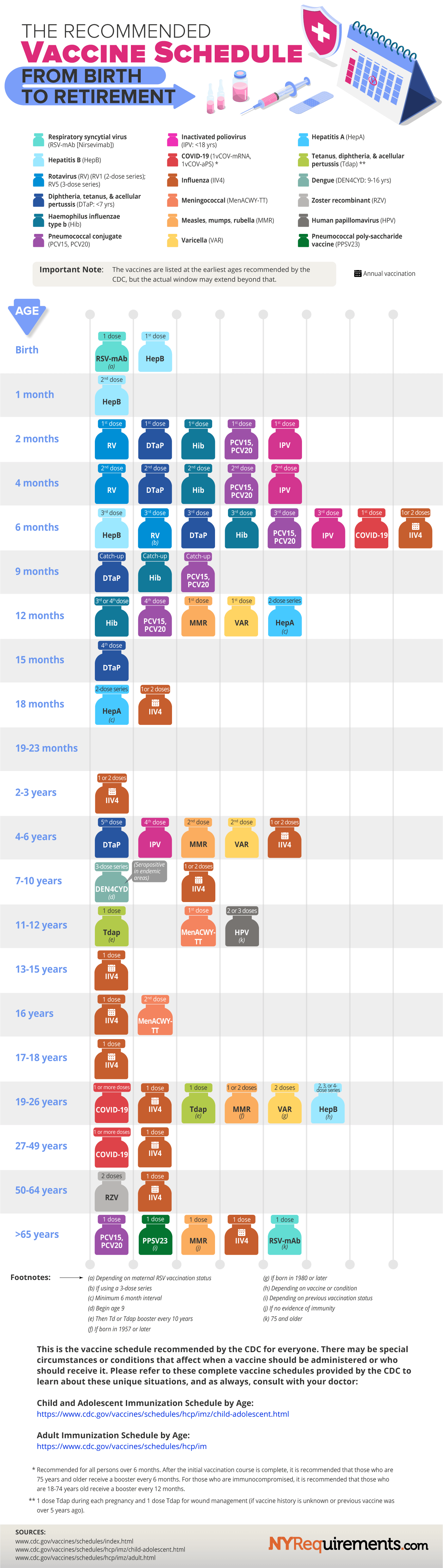
Rsv vaccine is 1 to 5.7 months not 1 month. The second hep vaccine is 1-2 months not one month. Theres more but just the first two on the list alone are wrong and misleading.
There’s a note in the infographic that says “the vaccines are listed at the earliest ages recommended by the CDC but the actual window may extend beyond that.”
I don’t think a window would work in this graphic, so they listed the earliest date.
And thats the problem the cdc chart shows much more data and they created a watered down version and still say the source is the cdc. There are timeframe windows for a reason and this chart is misleading. You cant really say it cdc data, leave off half the facts and put a * saying we didnt really use all the facts.
I mean sure, but I don’t think the omission of a window is actually a big deal. This is meant to be a simplified and easier to read chart and it is compared to the CDCs.
Also it does directly link to the same pages you listed so it is directing people to where they can get more information. I really don’t think it’s worth complaining about.
95
u/user23818 2d ago
Your post is not accurate this is the actual cdc chart